Developing SpyCam
The story of how I went about creating my first iPhone application SpyCam back in 2014, and the important things I learned along the way as I faced the unexpected challenges of development
The Idea
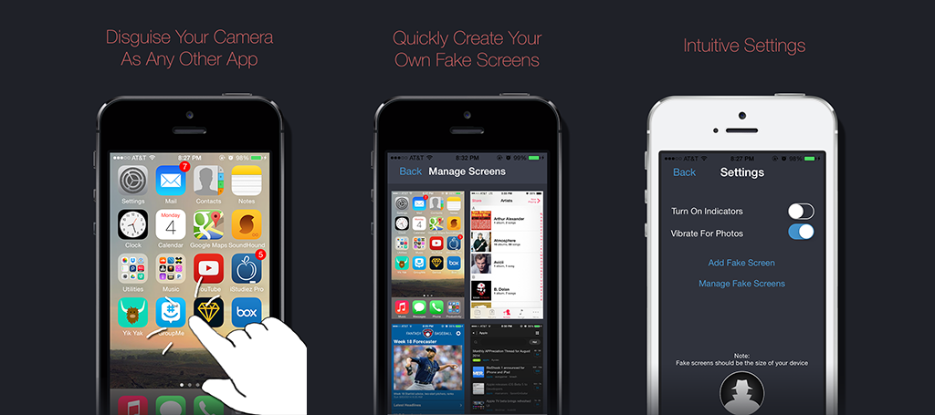
SpyCam is an application I developed during the summer of 2014. I had been learning iPhone development and reading books such as the highly recommended iOS Programming: Big Nerd Ranch Guide over the year and decided that it was time to make an application to better fortify my knowledge. I ultimately decided to make SpyCam; an application meant as a “spy” tool for kids and much like the spy tools I used to play with in my own childhood. The premise of Spycam was simple: a camera application that could be used while disguised as any other application on your phone. Specifically, the user should be able to take screenshots of other applications and open in them in the application; thus appearing to be in that other app while interacting with the SpyCam.
Although marketed towards kids, the application had many real world uses as well. One would be to use your phone as a home security device, recording a room while appearing to be on the home screen. Another could be to record evidence of a public disturbance. With all of these use cases, I wanted to make sure the application was easily accessible to anyone, while still hitting the young market that most often buys apps from the App Store.
Prior to beginning development I made sure to research the App Store for any apps that may be similar. I found several that served similar purposes, but none that would allow the user to disguise the application as another one. These other apps were also outdated and didn’t not look well designed. Several of them however had multiple hundreds of reviews. These findings confirmed both that the idea was viable and a potentially popular concept with the right execution.
Creating a UI with no Visuals
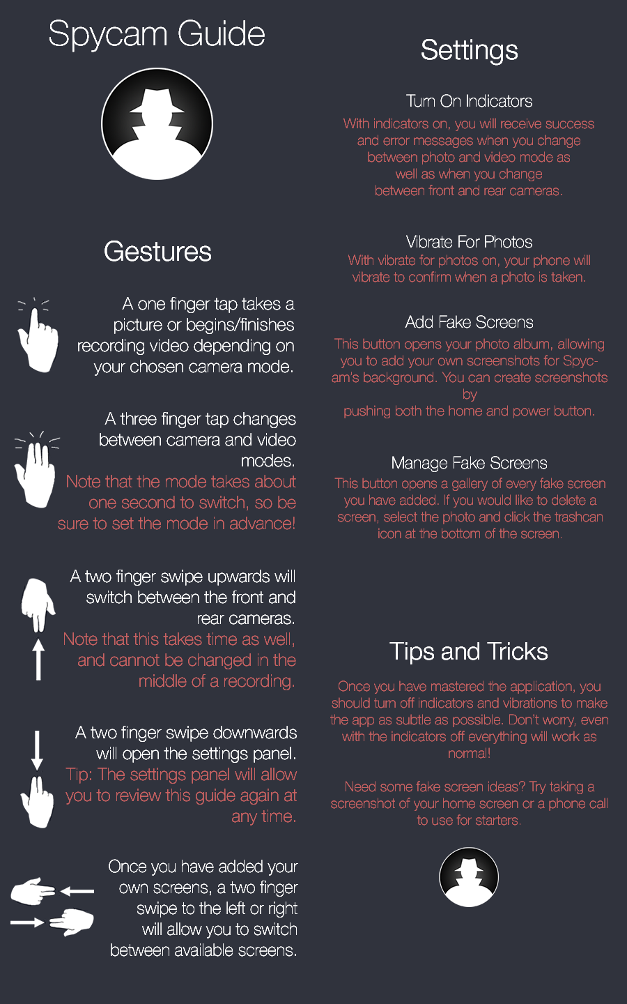
As I got to developing SpyCam, I quickly found one challenge that I would certainly have to overcome if I were to have a successful app. If my application was going to be entirely discreet and disguise fully as another application, it could not have any visual components.
This meant that all interaction with my application would have to be entirely gesture based. However, I wanted my app to be as intuitive as possible and I couldn’t just throw any random gestures in and assume they worked. So I began by listing out all of the possible options the user might need: take a photo, take a video, open the settings, switch front/rear camera mode, and move between fake screens.
Beginning with the most important, I decided that the most simple gesture should be assigned to taking a photo or video; a one finger tap. I initially experimented with having a single tap for the photo and a long press to begin taking video. Unfortunately, the camera took too long to switch modes on older devices, and without a visual cue this had potential to confuse the user. Further, after a video a quick photo tap would be delayed as the camera tried to switch modes, and again without a cue the user wouldn’t know when the photo was successfully taken. Therefore, I decided that it would be simpler to allow the user to manually switch modes with a three finger tap, with the additional benefit of allowing the video to record without holding the screen and finish with another tap.
After these gestures were sorted out, I considered how I would want the rest of the gestures to work together. I realized that I could create a sort of physical space in the application, if the Settings window was imagined to be under the screen, and the fake screens on the left and right of the screen. With this conceptual philosophy, I decided to make the corresponding gestures a two finger swipe left or right to access the fake screens, and a swipe down to access the settings. Finally, I used the two finger swipe up to change the camera from front to rear, as it felt most natural amongst the group of two finger swipes.
I tested these gesture choices for a long time, as well as allowed others to play with them, in order to ensure that they were as intuitive as possible. Once I was finally satisfied, with my choices, I moved on to the next problem with the lack of UI. That is, I needed to explain to the user how the application would work on their first launch and make sure that they truly understood it so that they knew what to do once they reached the application’s main black screen (the default screen when interacting with the camera, prior to adding personal screenshots).
This problem did not end up taking too much research, as I found the extremely flexible EAIntroView Cocoapod, which enabled me to create a simple slideshow of sorts to explain the gestures. On the first launch of the application, this slideshow would open and demonstrate each gesture type, with a figure of a hand making the specific gesture described. To further ensure the user could not forget any of the gestures, I included a review guide in the settings, listing all of the gestures could be reviewed.
While at this point I felt happy with the user interface I created, I still felt that an absolute beginner might want more feedback towards their actions. I created two settings, therefore, to allow for this. The first was a setting called “Turn on Indicators”. With this setting on, a quick HUD message would pop up explaining what the current gesture did. For example, swiping up with two fingers would state that the camera switched from the front-facing camera to the rear-facing camera or vice versa. Tapping with three fingers would state whether the app switched to camera or video mode. I automatically set this setting to true for all new users, with the tip that they should deactivate it once they understand the interface, as it limits the secretivity of the application.
The second setting I added was called “Vibrate for Photos”. This setting caused the phone to provide a short buzz whenever a photo was successfully taken and saved. During testing, I found that this was an incredibly helpful feature, as the user could immediately determine whether they took a photo or began filming a video on a tap, had they forgotten what mode they were in.
Finally, I was happy with the interface I created, particularly in its intuitivity and how effectively it could teach a new user how to use the app. At this point, I worked to perfect all of the graphics in the application, creating a theme that I felt fit the concept of a ‘sleuth.’ I was truly surprised with the time I ended up needing to devote to create graphics for each size device and design everything in the settings and guides. Even creating the perfect screenshots for the App Store and writing my app description took time, because I wanted to make sure everything was perfect. Yet, at last I finished and submitted to the App Store, only to find the “Waiting for Review” wait time to be the most excruciating part of it all.
The Submission Experience
After about two weeks with my app in review and constantly checking my account for updates on the process, I finally received a response. To my shock, my app had been rejected. Unfortunately, although I had reviewed the App Store Review Guidelines to ensure that my app was allowed, it turned out that there had been a rule disallowing apps that recorded without an indicator on the screen that the application was doing so. Specifically, 3.3.8 from the iOS Developer Program License Agreement (PLA) states “...a reasonably conspicuous audio, visual or other indicator must be displayed to the user as part of the Application to indicate that a Recording is taking place.”
This was frustrating for several reasons. First, 3.3.8 seemed to be a rule specific to applications that collected data from the user and meant to protect a user’s privacy. My application, while not providing the required indicator, only recorded when requested by the user, and no video or photos were stored anywhere other than the user’s device. Secondly, I had of course spent a large amount of time making sure the application was perfect, and adding a recording indicator to the application would defeat the purpose. Finally, I had researched the App Store prior to beginning development and found a slew of apps that did very similar things without any indicators.
With that last point in mind, I decided to write back to the reviewer and ask why my app had been rejected if similar apps were allowed, pointing to several examples. The response in short said that this rule was more enforced now and that they would look into those other examples and potential require that they update to show an indicator as well. However, they also offered to set up a phone call with an App Store reviewer who could answer any further questions I had. I quickly agreed, and a few days later had that phone call. I asked the reviewer what she recommended as the best approach to keeping my application’s intent while aligning with the PLA, as well as several other more specific questions regarding my application. Following my phone call, I thought about the situation for several more days and then made the hard decision to move on from the application. I felt that anything I added would hurt the experience I had created for my users and would just feel like a workaround. The facts were that the concept of my application was not one that Apple seemed to want in the App Store, and that it was time to move on to new ideas.
Conclusion
Ultimately, this experience ended up being slightly disappointing yet overall still a very worthy experience through which I learned a lot. I had success in creating my first iPhone application on my own, designing all of the elements and considering specific challenges along the way, even if it was not accepted into the app store. I also learned a lot about the application submission process, beginning with experience creating a submission page, working through the developer center process from scratch, and designing the perfect screenshots and description. I then also learned about the many rules of the App Store, and that just because one application was accepted with a certain feature, it doesn’t mean yours will be as well. Finally, I was able to have the experience of talking to a App Store reviewer live, and ask her any questions I had about my application and the process.
In the end, even though I did not end up with the outcome I had hoped for, this project still succeeded in its ultimate goal: providing me with the real world experience of creating an application for the App Store all on my own.